Typography
Typefaces
The Vassar College style guide uses the following typefaces. Masqualero should be used primarily for headlines, and Covik Sans should function as a supporting typeface. Both typefaces are available to Adobe Creative Cloud users via Adobe TypeKit. Source Sans Pro should be used for all body copy and it is available on all Vassar computers.
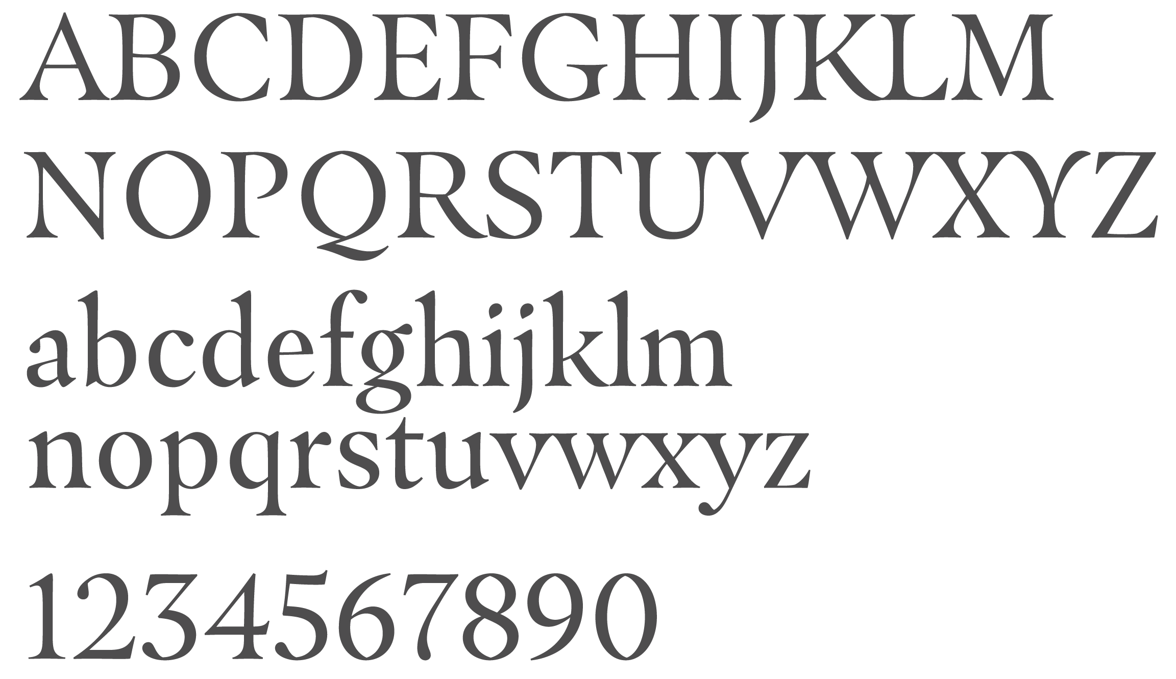
Masqualero
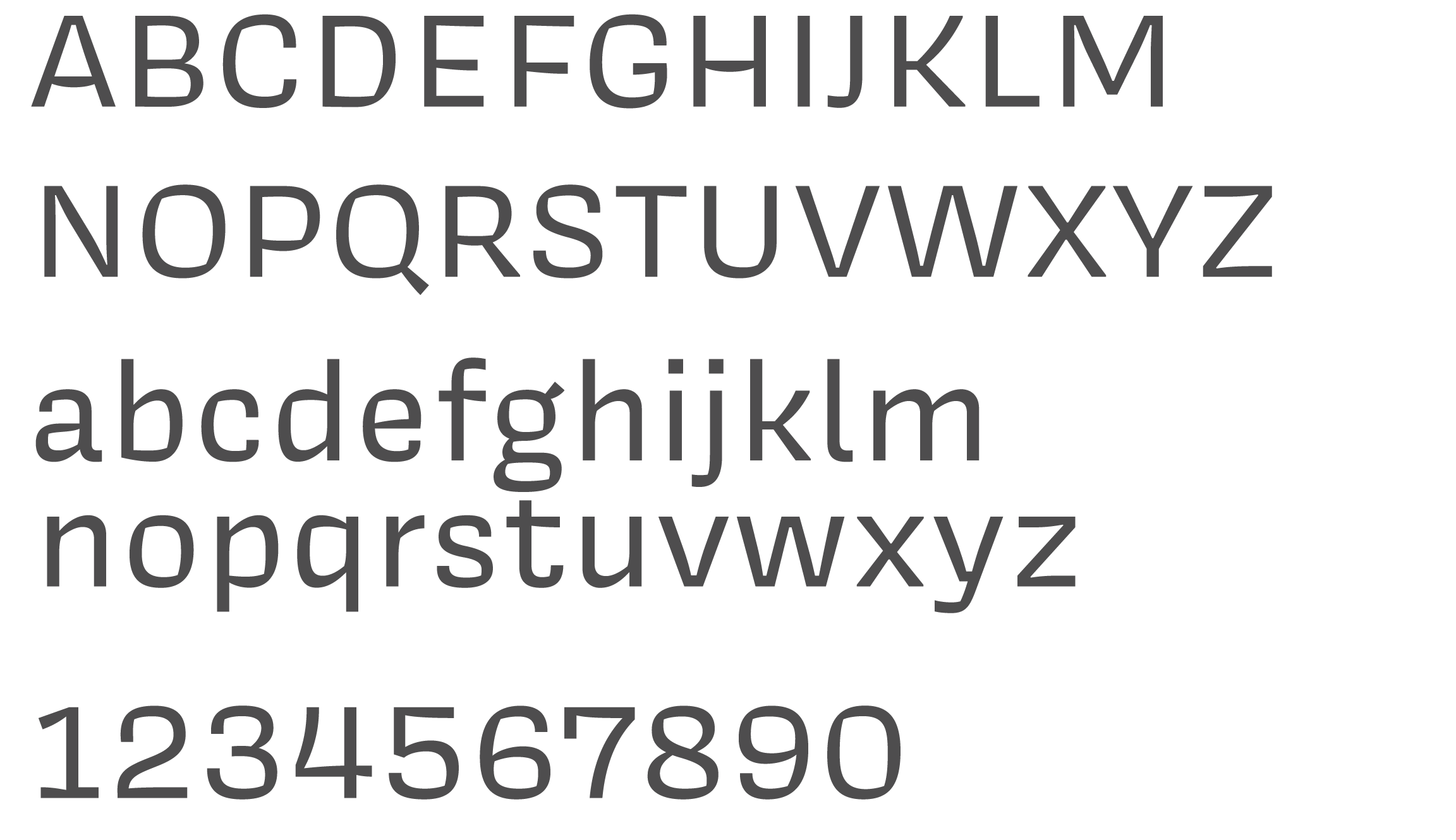
Covik Sans
Source Sans Pro
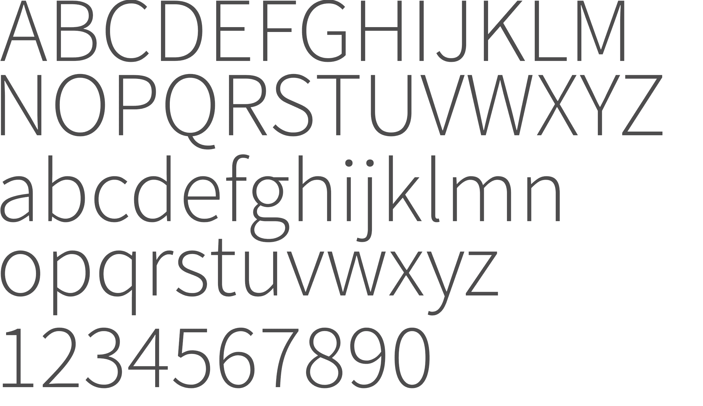
For most situations, you will want Source Sans 3, which is not variable. The variable version of Source Sans is available from Adobe’s Source Sans GitHub repo, in the VF directories.
Variable fonts allow designers more control over certain characteristics of a font, such as weight or width. Learn more about variable fonts.
Typesetting Best Practices
Setting type is a subtle art and it’s important to have standards in place to ensure legibility and continuity of the style. Here are some general rules to keep in mind when laying out type for headlines or body copy.
Headlines are always set larger than the body copy and in a bold weight, which provides the most contrast from body copy. Body copy should be set between 7–11 pts for print, and 12–16 px for web.
Things to Avoid When Setting Headlines
- Do not create your own modifications to the font. Use only the typefaces provided.
- Do not place the headline over a photo in such a way that the legibility is compromised.
Things to Avoid When Setting Body Copy
- Do not track out the body copy more than 20 pts as it’s difficult to read.
- Do not set body copy in all bold; it will become too dense to read at small sizes.
- Do not place the copy over a photo in such a way that the legibility is compromised.
Headline Treatments
There are a variety of headline styles that create interest in a design. Having several styles and spacing options to choose from gives each piece variety from page to page. The format, available space, and layout pacing will determine what treatments work best within the design.
Headlines & Design
Many print, digital, social and mobile communications blend textual and graphic elements to tell a story. To successfully pair a headline with an image or design element, consider the two as complementary, not separate, entities. The headline provides context for the image or graphic element, while the design sets a visual tone. Considering how the two work together will amplify your message and extend its reach and appeal.
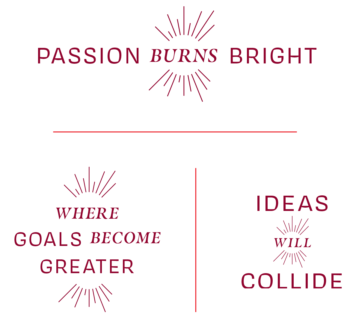
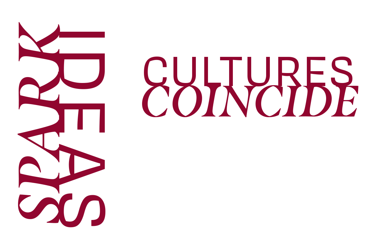
Spark Headline Treatments
In cases where the headline is the main focal point of a composition, the spark graphic elements can be combined with the primary and secondary typefaces to create emphasis. Vassar_sparkHeadlineTreatment.ai (Illustrator file)
Tension Lock-ups
This headline style is used as an expressive treatment to create visual tension between two words. These lock-ups work especially well in placements where the two words can meet physically (e.g. corners or meeting pages) Vassar_TensionLockups.ai (Illustrator file)
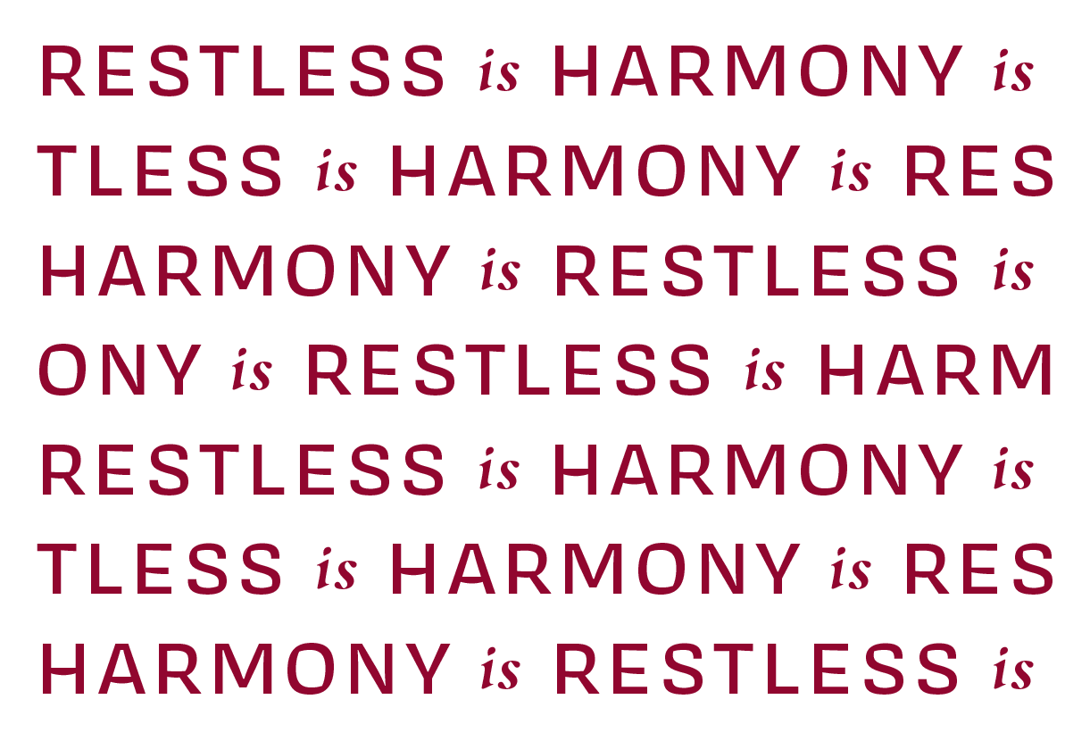
Textural Type Treatments
These type treatments can be used as texture or pattern in larger compositions or style moments.
Textural Type
This textural type approach takes two opposing ideas and creates a textural pattern out of the repeating statement. Vassar_TexturalType.ai (Illustrator file)
Radial Type
This approach sets messaging on concentric circular paths. The message can repeat or vary throughout the design. The space between messages should scale along with the size of the circle. The larger the circle, the more space between the end of one message and the beginning of the next. Vassar_RadialType.ai (Illustrator file)